
Color Theory Masterclass: Online Courses To Improve Your Palette Skills
Sharpening your color skills can totally change the way you create art or design. Whether you’re a hobbyist just starting out or a working professional wanting to refresh your eye, color theory is a foundation worth focusing on. I’ve found that online courses are pretty handy for getting into practical skills and techniques to take your palette game up a notch. If you’re feeling a bit lost when it comes to mixing, matching, or confidently picking colors, there are a bunch of interactive and selfpaced resources to guide you through the essentials and beyond. So if you’re up for a color theory masterclass, I’ve rounded up the best options and tips to get you started.
Why Mastering Color Theory Matters for Creative Work
Understanding color isn’t just about picking pretty shades. For a painter, knowing why warm and cool tones look good together makes scenes pop. For designers, the right palette can drive more attention, and more sales. Color theory teaches you how colors interact and what moods or reactions certain combinations can cause in viewers.
Color use in digital art, graphic design, photography, and traditional painting all benefit from some color knowledge. A recent Adobe study suggests that posts with thoughtfully chosen palettes are more likely to catch the eye on digital platforms. So if you want every project to land stronger, it’s worth spending time building up your color skills.
Color systems and theories go back centuries. Online learning has opened new doors for tackling color foundations in hands-on ways, making oldschool ideas feel fresh and easy to apply. These courses help remove the guesswork that often comes with choosing hues or building entire moods with color.
Getting Started With Online Color Theory Courses
Color theory courses are way more interactive than those dry old textbooks. Most start with simple explanations—like primary, secondary, and tertiary colors—before walking you into topics such as color temperature, contrast, and harmony.
Most online courses let you move at your own pace. That’s been a huge help for me, especially when trying to balance art with daily life. Here’s what you might find inside a typical beginnerfriendly course:
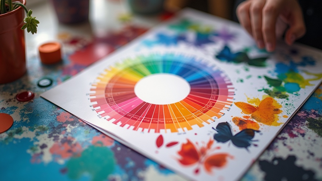
- Color Wheel Functions: How to build and use a color wheel as your navigation tool.
- Understanding Color Schemes: Tips for picking colors that vibe well together, like complementary, analogous, or triadic schemes.
- Value & Saturation: Adjusting brightness and intensity for realistic or dramatic effect.
- Color Psychology: Ways colors impact emotions and how to use this in your own work.
Courses often include exercises. For example, you might upload a photo and use digital paint tools to switch its palette or remix a classic painting’s colors. These are great for getting feedback and seeing your progress.
Quick Guide: Choosing the Best Course for Your Palette Goals
Online learning platforms are filled with color theory options, but not every course is made equal. Picking the right one will save you a lot of time and help you stick with it. Here are some easy to use tips for making your choice:
- Assess Your Level: Some courses focus on basics, while others target advanced techniques like digital painting or branding. Choose one that fits your background and ambitions.
- Check for Interactive Elements: Video demos, community critique, and downloadable resources all help you apply what you learn.
- Read Reviews: Look for courses with plenty of student feedback, this usually means you’ll get more actionable content.
- Preview the Curriculum: Some platforms let you preview the lesson outline. This can help you see if the topics match what you want to improve on.
- Policy on Lifetime Access: Life happens, so courses that let you repeat lessons or come back later are really helpful.
Stacking these factors makes choosing a relevant, worthwhile course much easier. Think about your own workflow and learning style before you get into it.
Common Challenges and How Online Courses Help
Even with a stack of reference books in my studio, I used to hit a wall with applying color theory. Here are a few struggles I’ve seen (and some online course perks that smooth things out):
- Color Mixing Confusion: Watching guided mixing demonstrations online helps clear up misunderstandings about blending paint or digital swatches.
- Palette Paralysis: Prebuilt color harmonies and exercises help spark new ideas and break you out of a creative rut.
- Lack of Feedback: Courses with community spaces or mentor input let you get real advice on your color choices.
- Applying Color Digitally: Many courses include tips and shortcuts for picking colors on tablets, in Photoshop, or with design software.
Mixing Paint vs. Digital Color
Paint, pencils, and pixels all mix differently. Hands-on demonstrations found in online lessons helped me avoid muddy paint colors and banded digital gradients. Some courses split up lessons for different mediums, which can be super helpful if you switch between digital and traditional work.
Analyzing Existing Art
Many online lessons walk you through tracking down color schemes in popular works, including paintings, movies, and ads. This practical breakdown makes the “why” of color choices more obvious, even for beginners. When you look over a classic work or a nextlevel cool ad campaign, you’ll start to spot the thinking behind every color choice. Breaking it down like this builds your own creative eye, so you can start to make bolder color decisions in your own projects.
Course Features You’ll Want to Check Out
Not all color courses include the same bells and whistles. Here are some cool features that I find worth considering:
- Live or Recorded Demos: These let you observe technique in real time or rewind for tricky sections.
- Quizzes and Practice Projects: Testing comprehension with fun challenges keeps you involved and helps strengthen memory.
- Downloadable Reference Sheets: Quick reference guides on harmony rules or swatchmixing methods can sit on your desk or tablet while you work.
- Community Forums: Learning from others can spark fresh ideas and show new ways to use theory.
Practical add-ons like these can make a course much easier to stick with and keep you coming back. Having these tools at your fingertips can give a boost to your workflow and keep you motivated along the way.
Types of Creative Work That Benefit From Color Training
- Digital Art and Illustration: Balanced palettes and unique color harmonies make characters, scenes, and icons pop on screens.
- Painting (Acrylic, Watercolor, Oil): Knowing how to mix and use color temperature is great for realism, depth, and mood.
- Photography & Editing: Adjusting tones digitally can make or break a photo’s vibe.
- Brand Design: Strategic color use helps companies nail their identity and improve recognition.
- Web and UI Design: Good color choices improve readability and make websites more inviting to visitors.
Whatever your field, solid color skills go a long way. Color theory is a smart investment in any creator’s toolkit. The creative world—from gaming designers to muralists—is always looking for folks with a sharp sense of color. Even if you’re only creating art for yourself, understanding palettes can help you bring to life work that feels finished and unified. Plus, having color theory on your resume is appealing to clients and employers, signaling you’ve got an eye for detail.
Frequently Asked Questions About Color Theory Online Courses
Here are answers to some questions I get asked a lot by folks wanting to learn more about using color:
Question: How long does it take to see progress with color theory?
Answer: Most people notice improvements in just a few weeks if they practice with the exercises. Reviewing and redoing lessons helps a lot, too.
Question: Can I really improve without expensive supplies?
Answer: Yes! Many courses are digital and need nothing but a laptop or tablet. For traditional art, studentgrade paints and papers are fine for learning purposes.
Question: Do I need previous art or design experience?
Answer: No. Many beginners start from scratch. Some courses break big ideas into manageable parts, which can be less overwhelming for new learners.
Question: Are there free options or lowcost color theory courses?
Answer: Definitely. Websites like Coursera, Udemy, and Skillshare have bargains and free trials. YouTube is packed with highquality lessons by professional artists, though these might lack handson feedback.
Wrapping Up: Why Color Learning Online Really Pays Off
I’ve found that building strong color skills pays off every time I start a creative project. Online color theory courses offer practical feedback, engaging exercises, and realworld examples that help you move ideas from your head to finished art, fast. Once you stop worrying about picking the “right” color and start understanding the “why,” creativity flows so much easier. Take your time, enjoy the process, and watch how much better your palette gets, one lesson at a time.
If you want extra tips, don’t forget to check in with online communities and color theory forums. Sharing your work and ideas can give a boost to your skills and open up entirely new ways of thinking about color. There’s always more to spot and more to try out as you keep creating, so keep pushing your palette further. Soon, you’ll be the one other people turn to for advice on making their art come to life.
Leave a Reply